srsakib
Active Member
Hello,
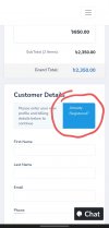
I found an issue in the order form. The order form is little bit confusing for those customers who are already registered.
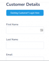
After the fina process, before the payment, there is an information form showing if the customer is not already logged in. Before that, there is button "Already Registered". When someone click on it then it'll redirect the page to the login page.
But, the most confusing part is that button. It's not understandable that it's a button & customers need to click on it. I got a few orders where customers have opened more than one accounts due to not understand it. Sometimes, they knocked for being confused.
Please fix it. You may add "Login Here" text or something like that which is understandable.
Thank you.


